SONG
yue .fyi
Recent Work
Counterpoint
OZ Cloud
Root for Thought
My Work
Zeppelin Mars
Wing-Spread Bridge
Rabbit Generator
MoreLess Branding
ABOUT ME
CONTEXT
MY ROLE
TOOLS
April - June 2023
(10 Weeks)
Team: Jeanyoon Choi
- Main page UI design
- Information Architecture Ideation
- Usability testing
- Prototyping & Animation
FIGMA
Adobe Suite
Adobe Suite
OVERVIEW
‘counterpoint is the relationship between two or more musical lines(or voices) which are harmonically interdependent yet independent inrhythm and melodic contour.’
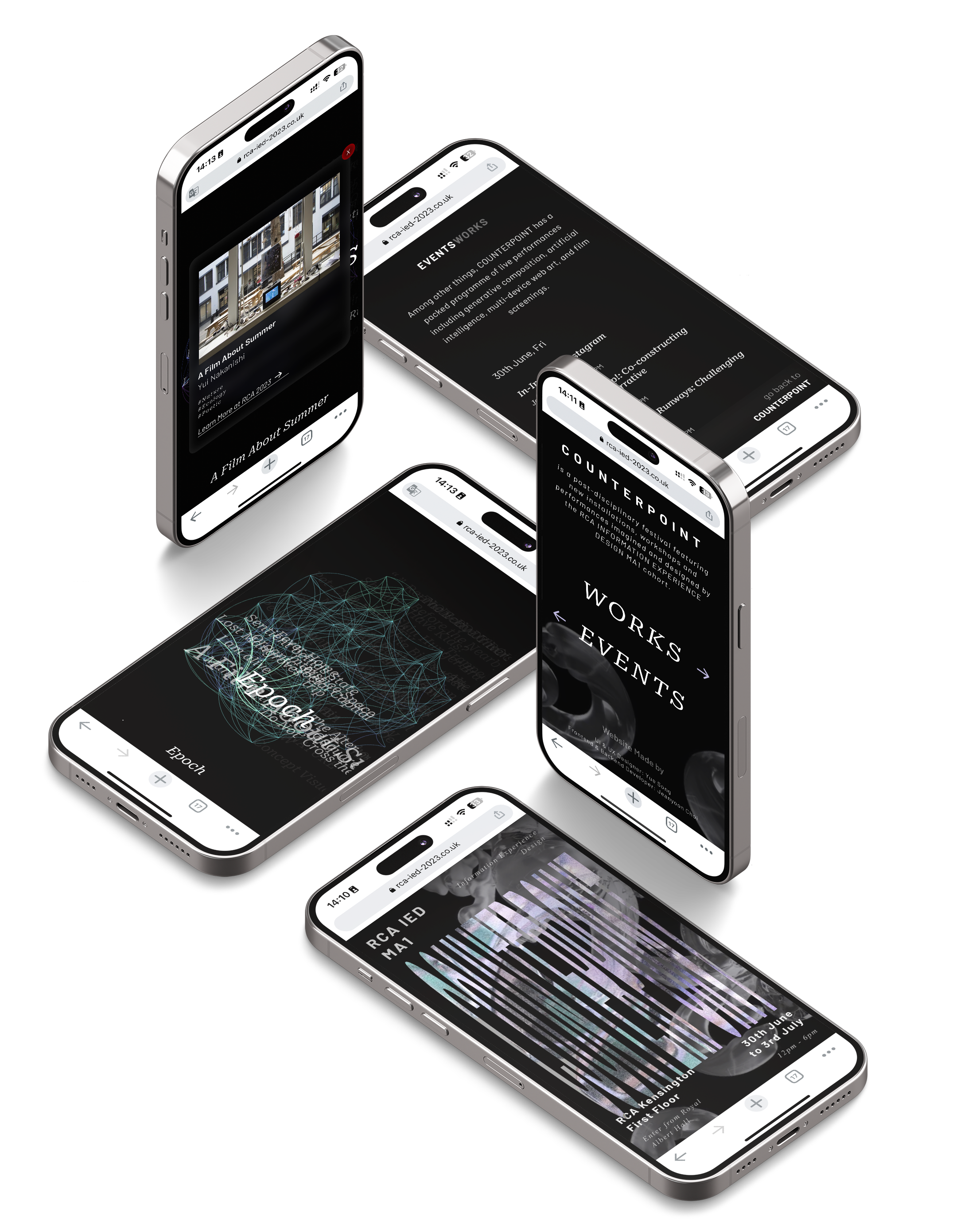
COUNTERPOINT is an interdisciplinary festival featuring new installations, events and performancesimagined and designed by the Information Experience Design MA1 cohort of artists and thinkers in year2023.
The range of works are an opportunity to immerse oneself into the creative responses to questions about the current status quo of our society, cultural context and the very notion of creativity and interdisciplinary.
DESIGN
BRIEF
1.
“Besides the exhibition place, we need an online platform to showcas everyone's work as well.”
2.
“An innovative interaction experience that speaks out our programme's ethics.”
3.
“We also have events other than everyone’s work in which we want audience to take part.”
DEFINE
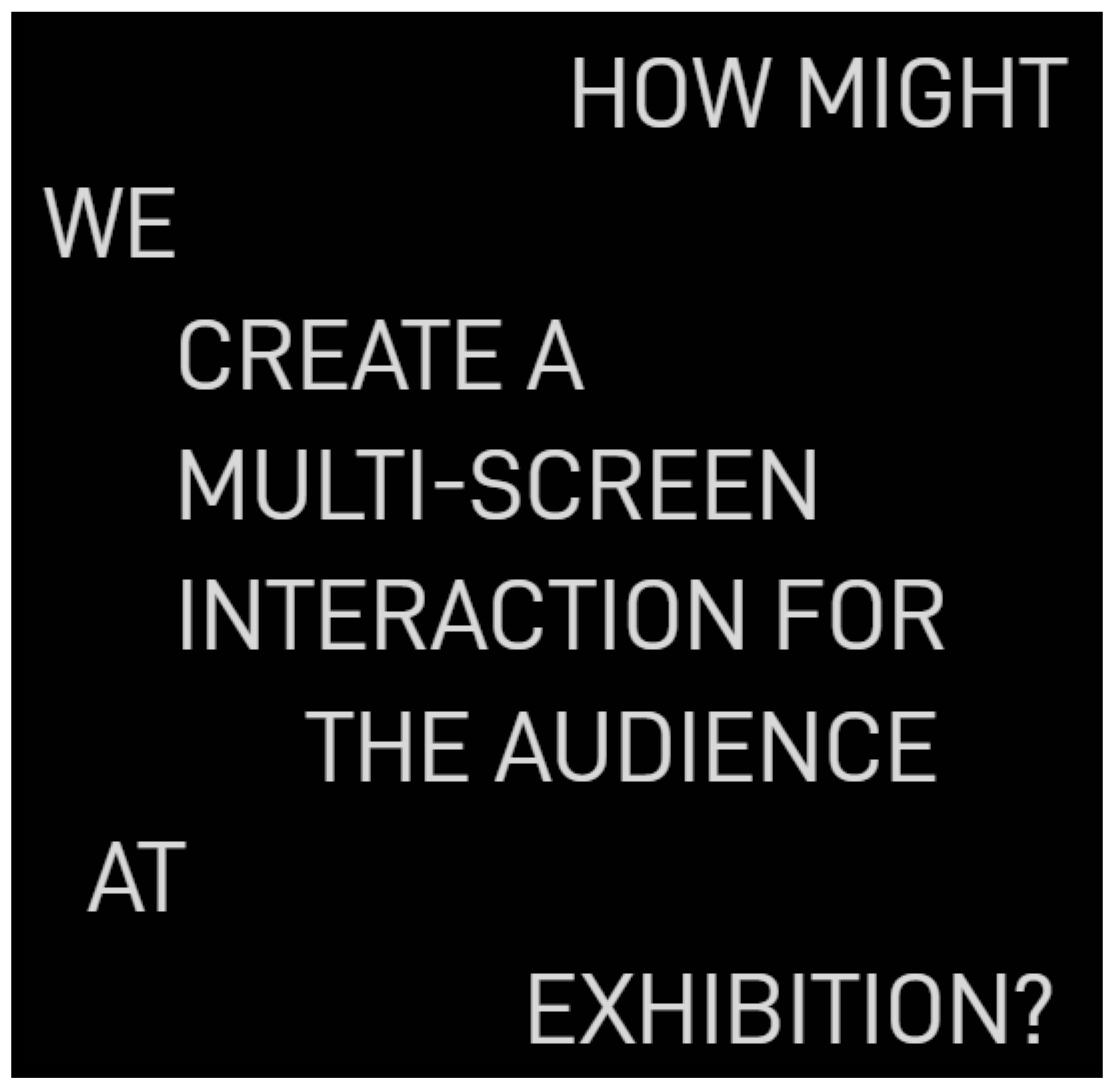
DESIGN QUESTION
USER FOOT
JOURNEY
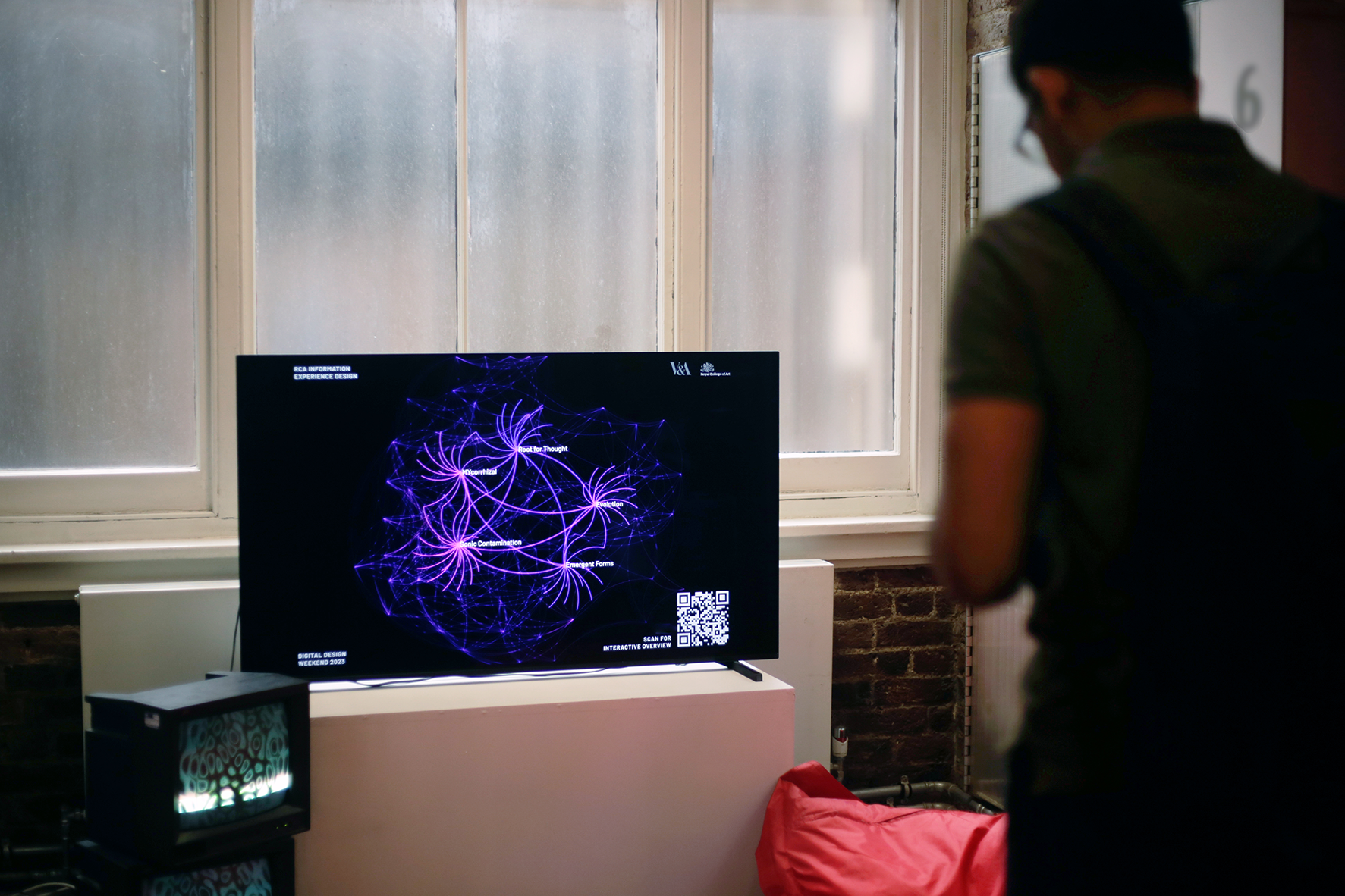
Our screen would be located right next to the exhibition entrance.
On the floor plan, we annotated the route as well as the moments when interactions happen.
Let’s see how their attention would be distributed, feel free to refer back to the floor plan:

USER EYEBALL
JOURNEY

BRAINSTORM
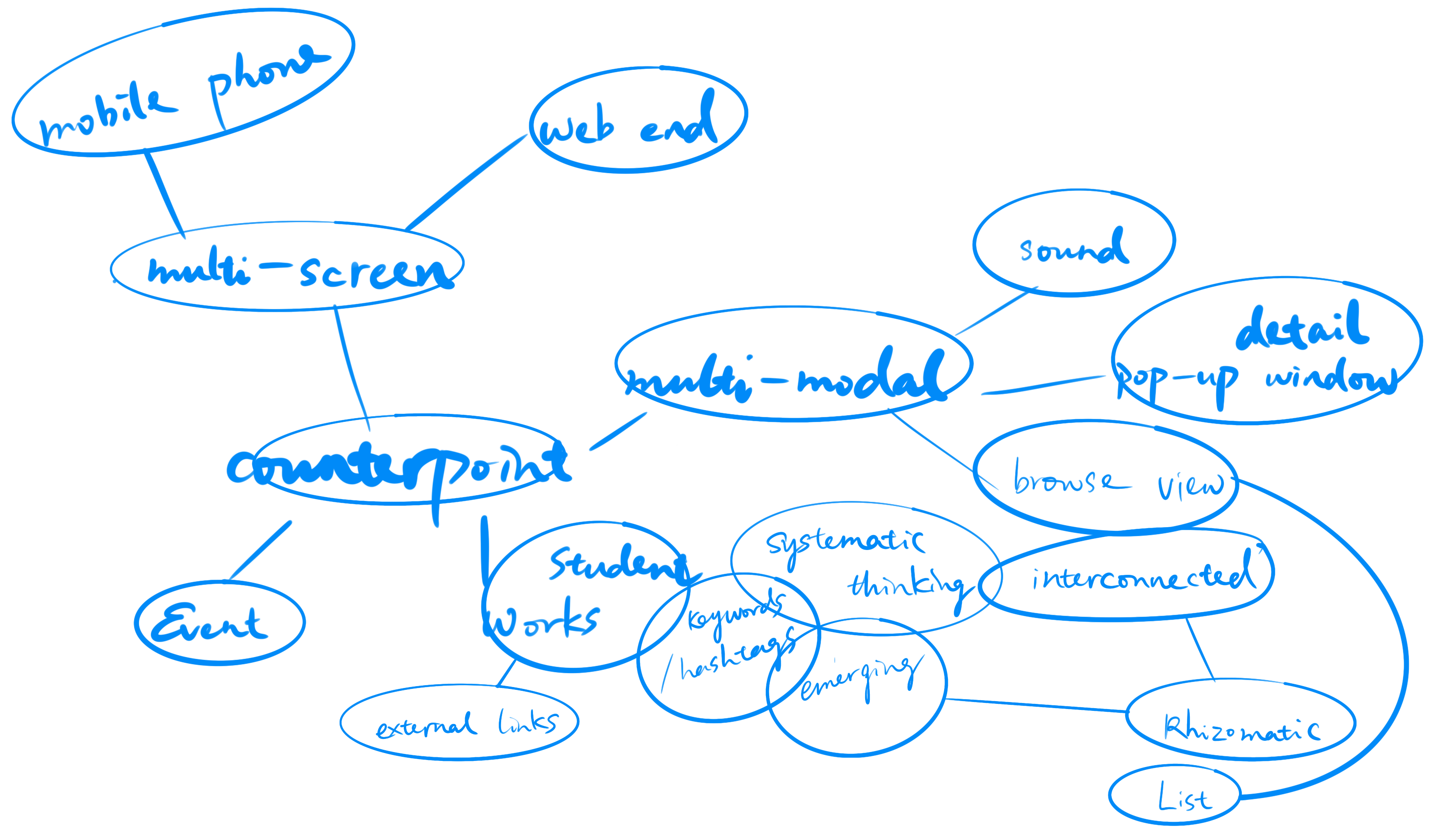

content/interaction-wise and user/stakeholder-wise.
INSIGHTS
1. MULTI-MODAL
“SOUND ON”
We need something to attract audience attention to the screen
- from the very first place
- and also when audience clicked on any work
2. NOVEL DISPLAY VIEW
RHIZOMATIC VIEW--
with keywords that grab connected titles
All the works should be linked by keywords, to create as many as connections we need to sum up roughly 50 words and let every student choose up to 10 words when submitting their work digitally.

3. GESTALT PRINCIPLES
The Principle of--
Similarity and Experience
- due to technical and time limitations the event page has to be as simple as possible and same format as the list view of all the works.
- how do we adress there’s one out of the other way of experiencing the interaction?
- how do we notify audience there’s event as well.
DESIGN
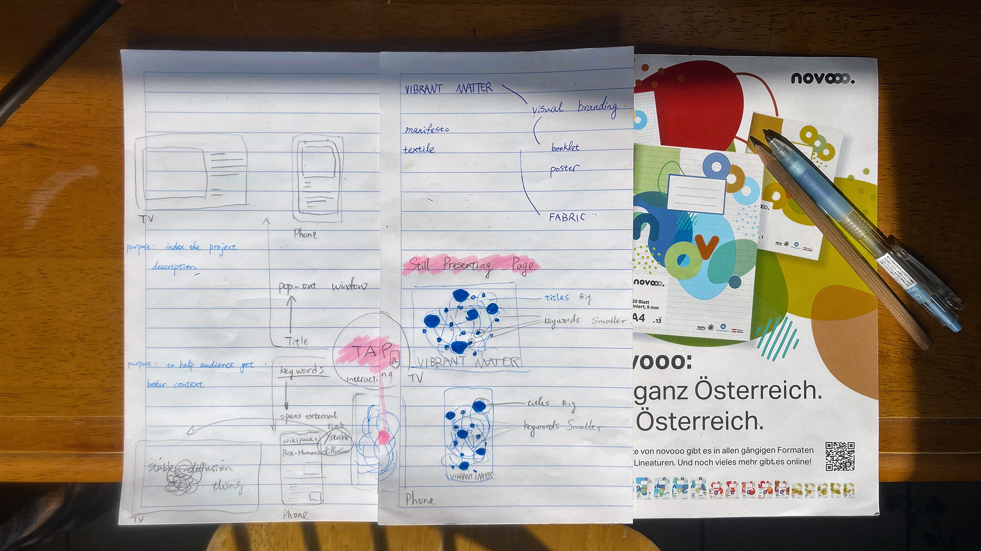
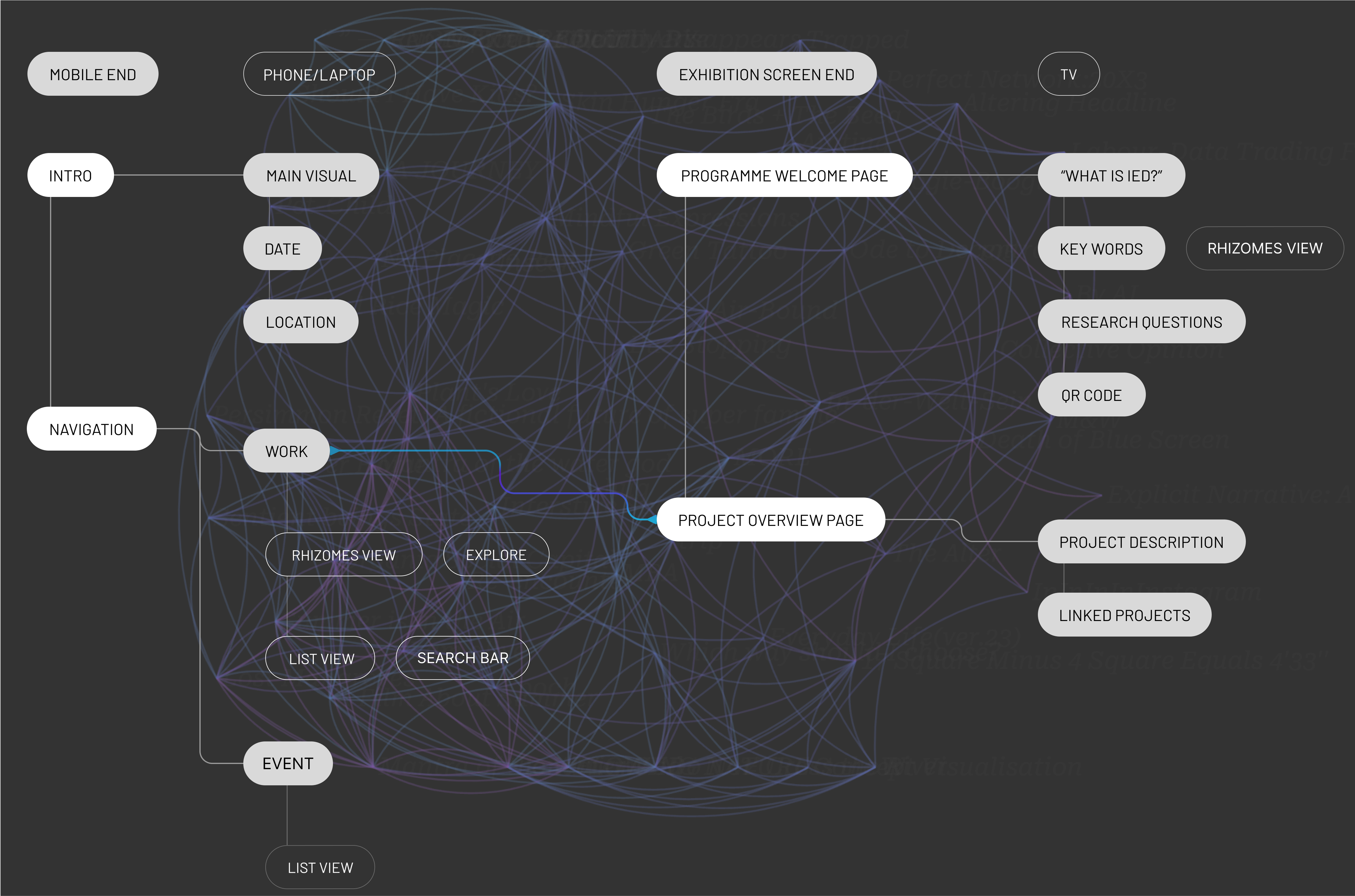
CONCEPTUAL WIREFRAME
WEBSITE HIERARCHY
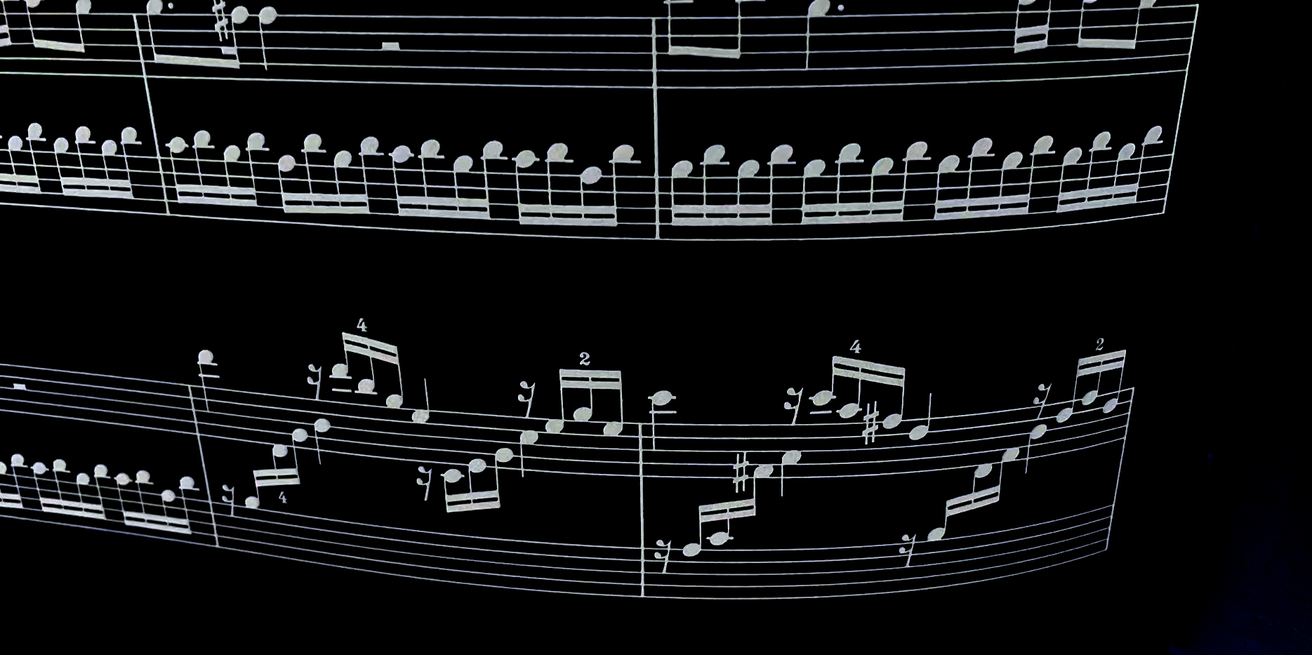
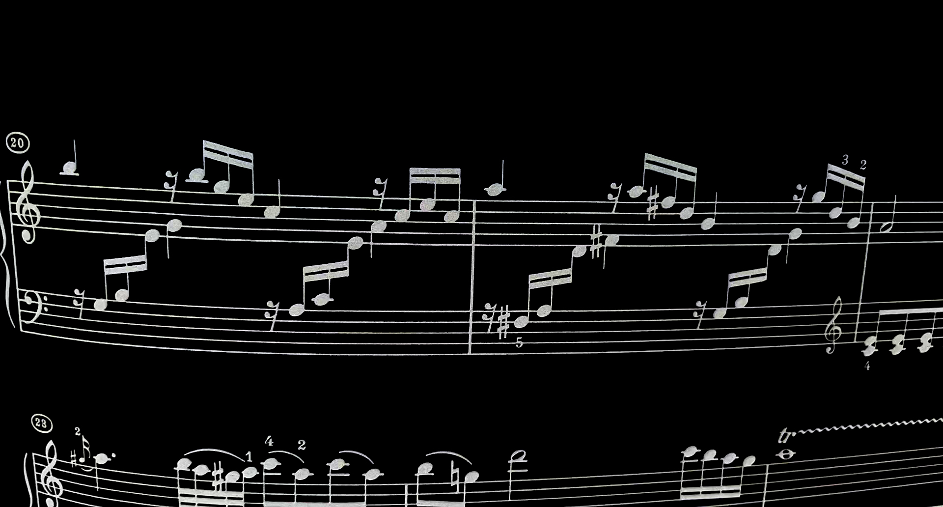
SOUND DESIGN
Die Sonate Nr. 16 C-Dur (Sonata facile, KV 545)
(out of developer’s personal preference :p)
COMPONENTS
Contrast creates emphasis as well as a path for the user’s eyes to follow.
VIRTUAL
JOURNEY MAP

Scroll down the event page ↓


Scan QR Code Below & TRY THE REAL PROTOTYPE
Iterated version for V&A Digital Design Weekend 2023
RE-CONCEPTUALIZE
SKETCH
